


Background Image
Background Image
Background Image
Background Image

Cybersecurity B2B | 2024 - 2026

My contribution

User Research

Usability Testing

Design Thinking

Information Architecture

Requirements Engineering

UX Writing

UX Concepts

Making a Cybersecurity Platform work for its users

A tech-driven platform, redesigned around real users – and ready for market.

Cybersecurity B2B | 2024 - 2026

My contribution

User Research

Usability Testing

Design Thinking

Information Architecture

Requirements Engineering

UX Writing

UX Concepts

Making a Cybersecurity Platform work for its users

A tech-driven platform, redesigned around real users – and ready for market.

Summary

From zero users to market-ready

When we joined the team, the software worked technically. But it had no real users, no validated use cases, and no shared direction. Over two years, together with the full Scrum team, sales, and operations, we turned it into a user-centered product with a clear market fit.

What we achieved

Changed tech-driven Software into userfriendly

Changed tech-driven Software into userfriendly

Turned scattered information into one clear picture

Turned scattered information into one clear picture

Going from no users to Market ready

Going from no users to Market ready

Design Decision #1

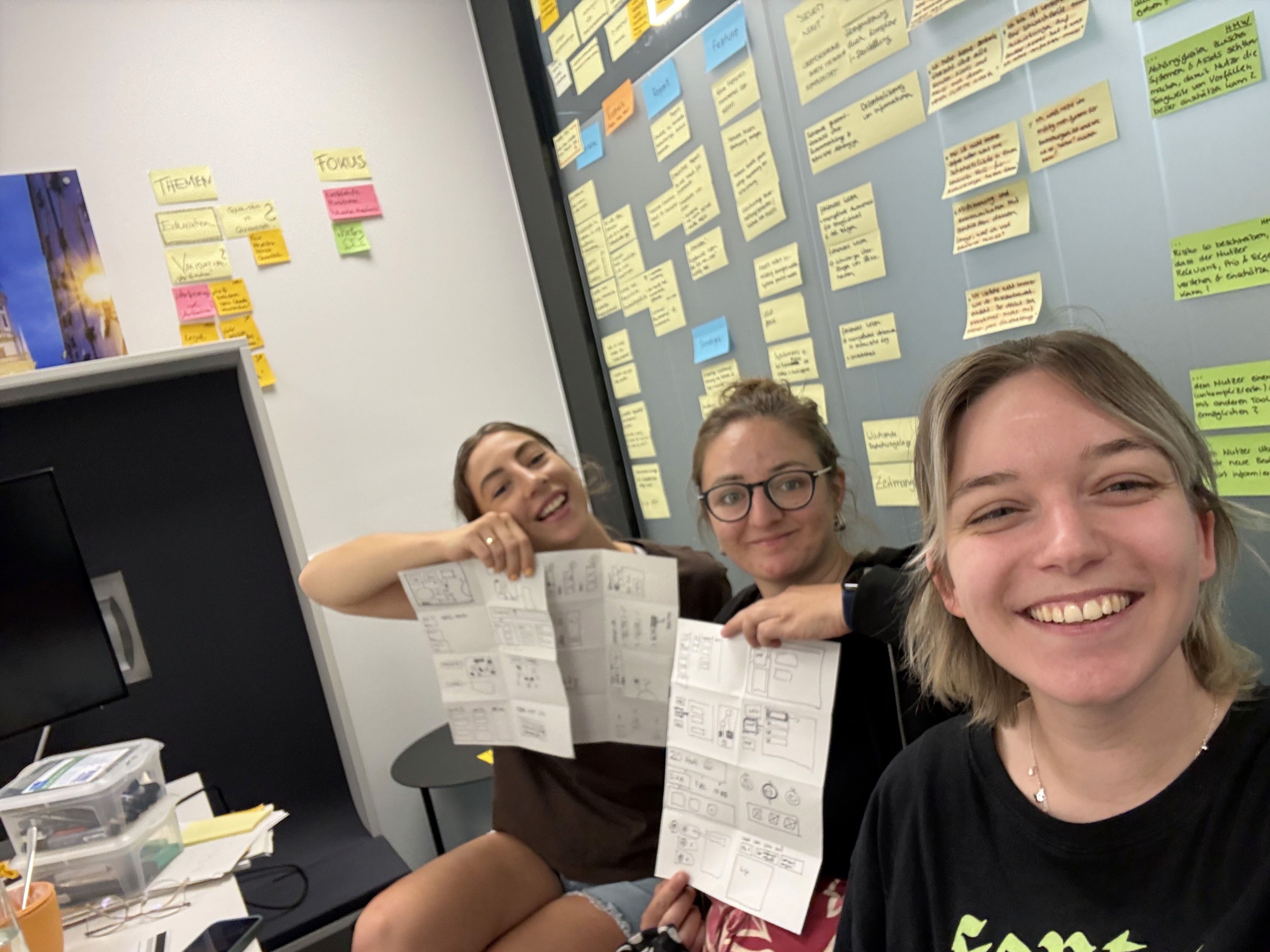
Setting a shared direction with a Design Sprint

User Research

Workshop Facilitation

Design Thinking

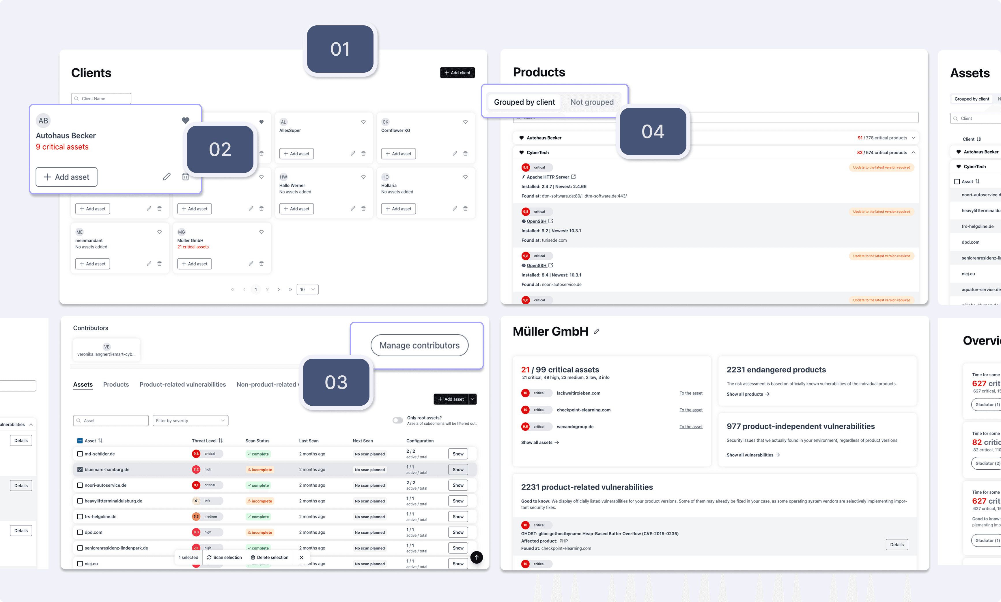
Before we could design anything meaningful, we needed alignment. The team was building on instinct and stakeholder requests, without shared goals or a clear picture of who the product was for. A Design Sprint gave us the reset we needed: two provisional personas, a long-term vision, and a guiding principle that stayed with us until the very end. "Freedom for Experts, Simplicity for Novice."

Read the full case study

Design Decision #2

Faster workflows through better navigation

Usability Testing

Information Architecture

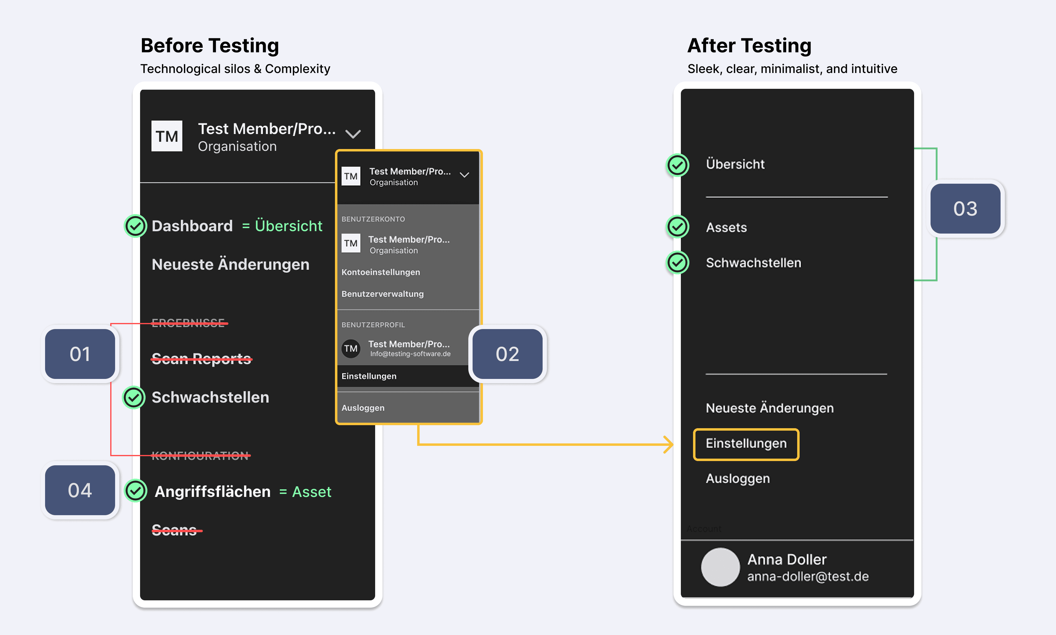
In early usability tests, users struggled to to find their way around. They lost time before even starting their actual tasks. We streamlined the navigation based on known user flows and core tasks, reducing six scattered objects across multiple categories to three clear ones.
01 - One unified structure

Two categories based on technical logic, invisible to most users. We merged them into one.

02 - Settings simplified

A complex context menu replaced by a single "Settings" entry. Users explore from there instead of deciding upfront.

03 - Three core objects

Reducing six navigation items to three central objects makes orientation faster and decisions easier.

03 - Three core objects

Reducing six navigation items to three central objects makes orientation faster and decisions easier.

04 - Clear naming

Key navigation objects were renamed based on user feedback to better match how users think.

04 - Clear naming

Key navigation objects were renamed based on user feedback to better match how users think.

Design Decision #3

Redesigning the heart of the software

Usability Testing

Conceptual Modelling

Information Architecture

The insight: users needed answers, not reports

The insight: users needed answers, not reports

After improving navigation, users still took long, roundabout paths. Watching them click through report after report, we started asking ourselves: Is this actually what they need? It wasn't. The reports were a product of technical process logic, not of user needs.

The approach: moving core information up with conceptual modeling

The approach: moving core information up with conceptual modeling

We restructured the core information architecture and moved the answer users were looking for one level up – making it the centerpiece of the software. The foundation was conceptual modeling: mapping content by user tasks rather than system logic. When I later encountered Object-Oriented UX, I recognized it as the framework for what we had already been doing intuitively.

01 - Content invetory for the full picture

By mapping everything we could identify connections across the whole system

02 - Objects, not pages

We clustered the individual pieces of Information into core objects users work with and built the structure around them.

03 - From process logic to user logic

The software was structured around how scans work. we looked at what users need to know.

04 - Scalable Foundation

When we added client management months later, the basic architecture held, no major restructuring needed.

Design Decision #4

Making technical data readable

Conceptual Modelling

Information Architecture

UX Writing

UI Design

The challenge: Built for the system, not for its users

The challenge: Built for the system, not for its users

The Asset Page existed, but its information was organized around technical process logic. Users had to work their way through it rather than getting a clear picture quickly.

The outcome: a clear view of what matters, at a glance

The outcome: A clear view of what matters, at a glance

We redesigned the page around one goal: give users an immediate understanding of an asset's current state, regardless of their technical background. In later usability tests, users navigated confidently and never asked for the old reports. The most consistent feedback: the overview was clear.

BeforeAfter

01 - optimized orientation: New header

Most important information at the top, research-based and clearly prioritized.

01 - optimized orientation: New header

Most important information at the top, research-based and clearly prioritized.

02 - Reduced information overload

Users can filter what's shown and choose how detailed they want it – list or board view.

02 - Reduced information overload

Users can filter what's shown and choose how detailed they want it – list or board view.

03 - information in context

Every data point comes with guidance on what it means and what to do next.

04 - Clear structure

Information grouped into digestible chunks instead of one long technical list.

04 - Clear structure

Information grouped into digestible chunks instead of one long technical list.

Design Decision #5

Designing a new feature in a fast-paced workshop

User research

Design Thinking

Information Architecture

Wireframing

Usability Testing

The challenge: a new audience, a new mental model

The challenge: a new audience, a new mental model

IT service providers wanted to use the software for their own clients. This wasn't just a new feature – it fundamentally changed how the software needed to work. New user group, new touchpoints, and an entirely different mental model.
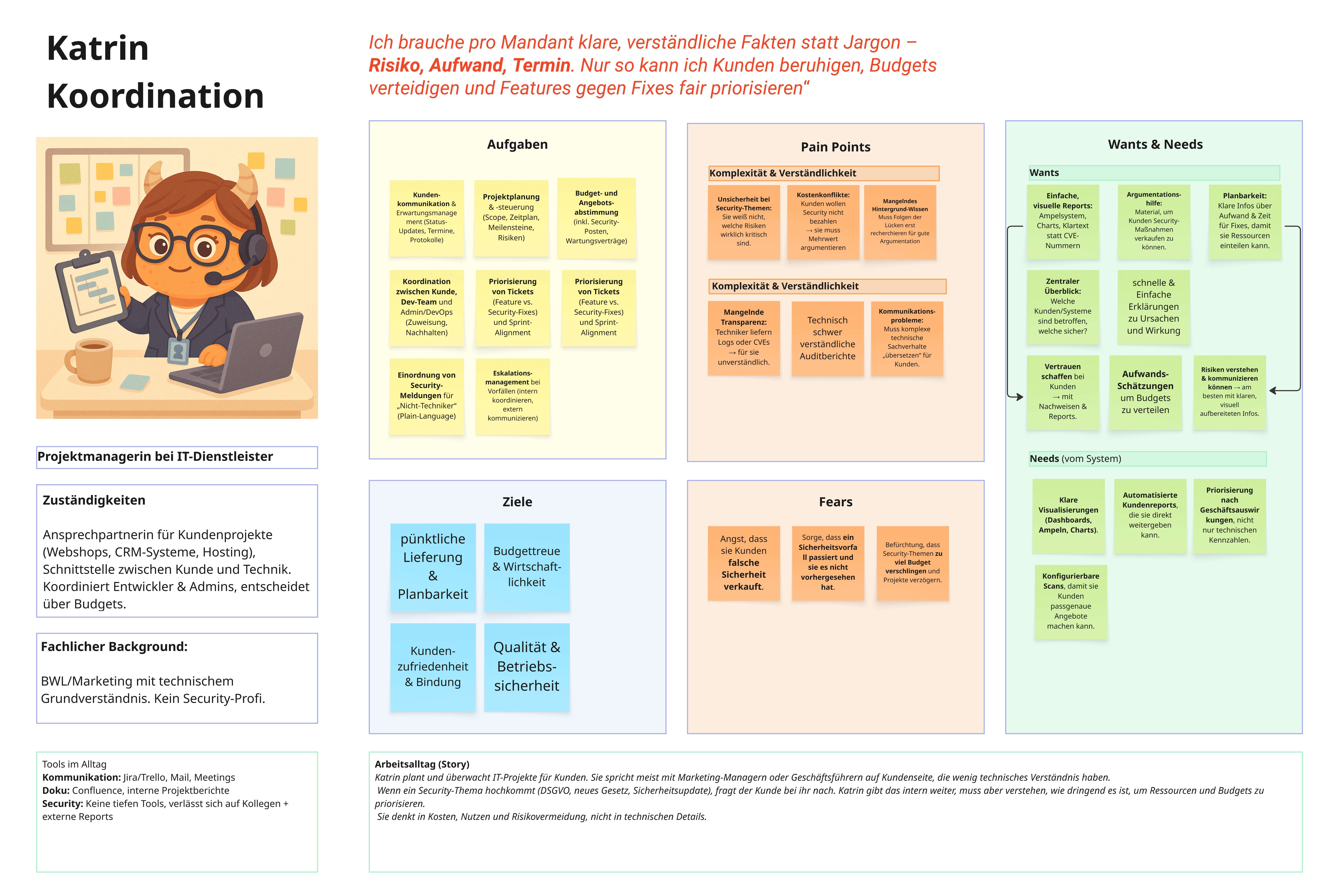
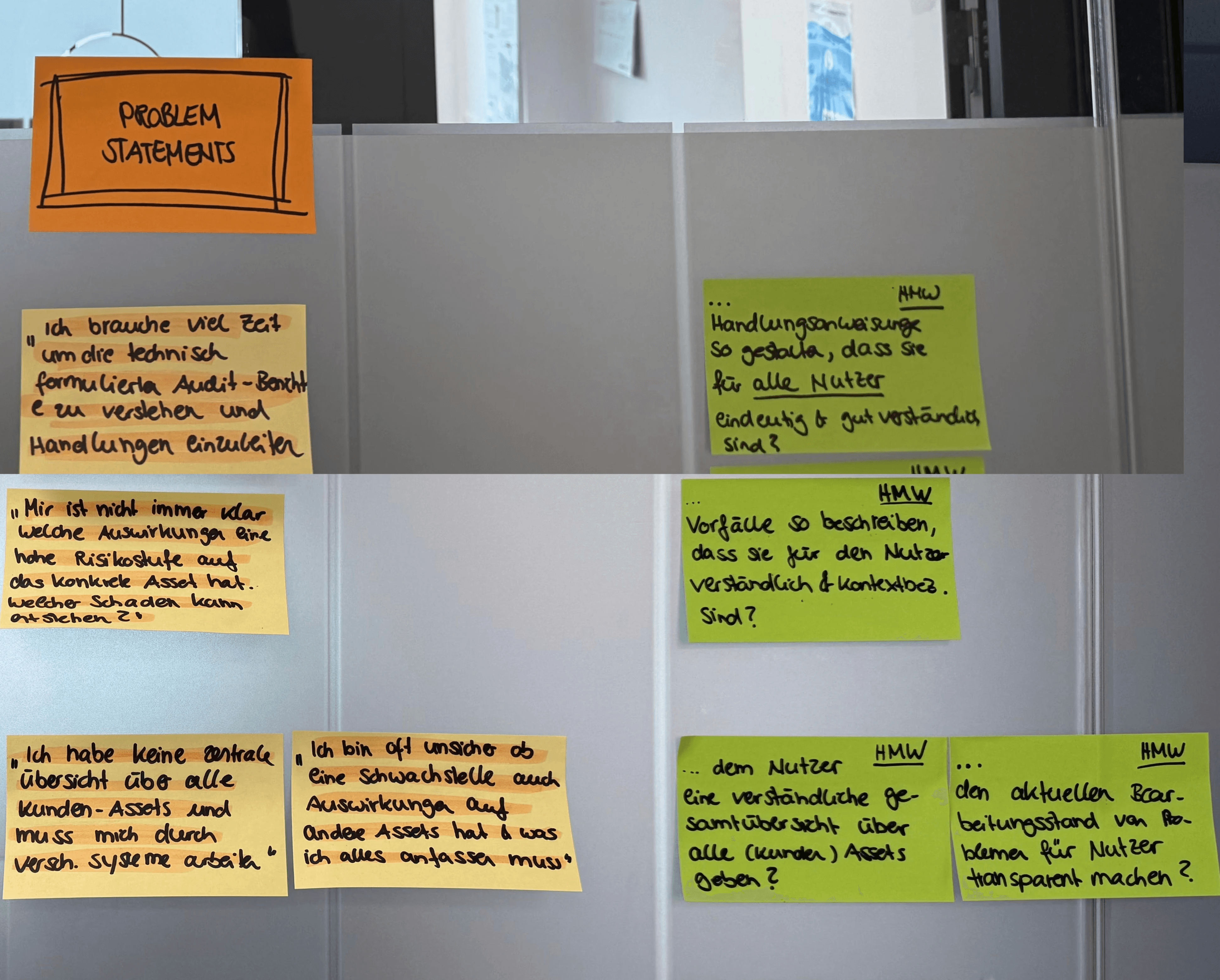
The approach: one interview, one workshop, one concept

The approach: one interview, one workshop, one concept

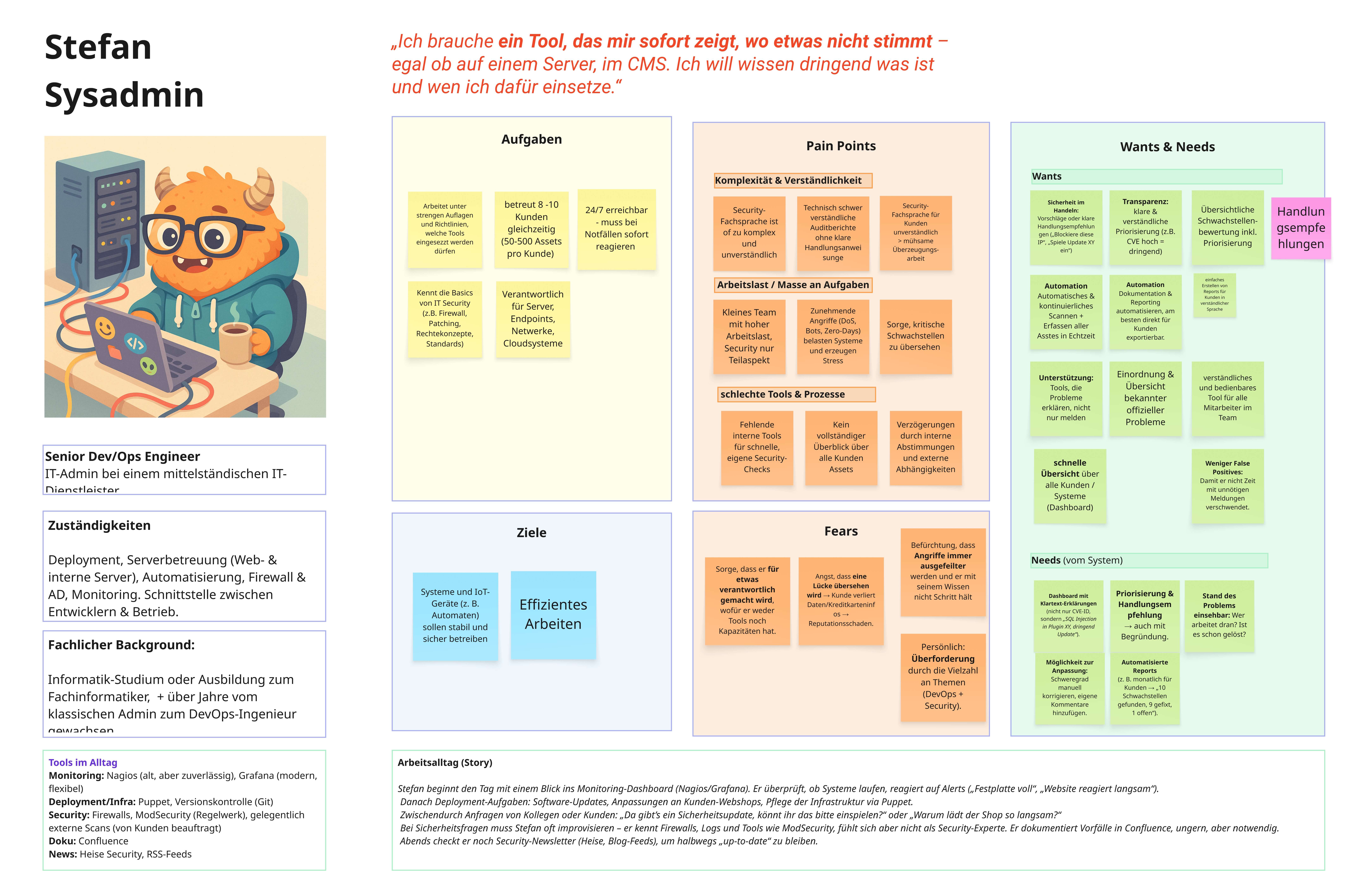
We started with a single interview with a pilot customer to understand the core needs. A two-day workshop with the team followed, resulting in a UX concept: which functions the feature needed, what it had to deliver for users, and where it would connect to the existing software.
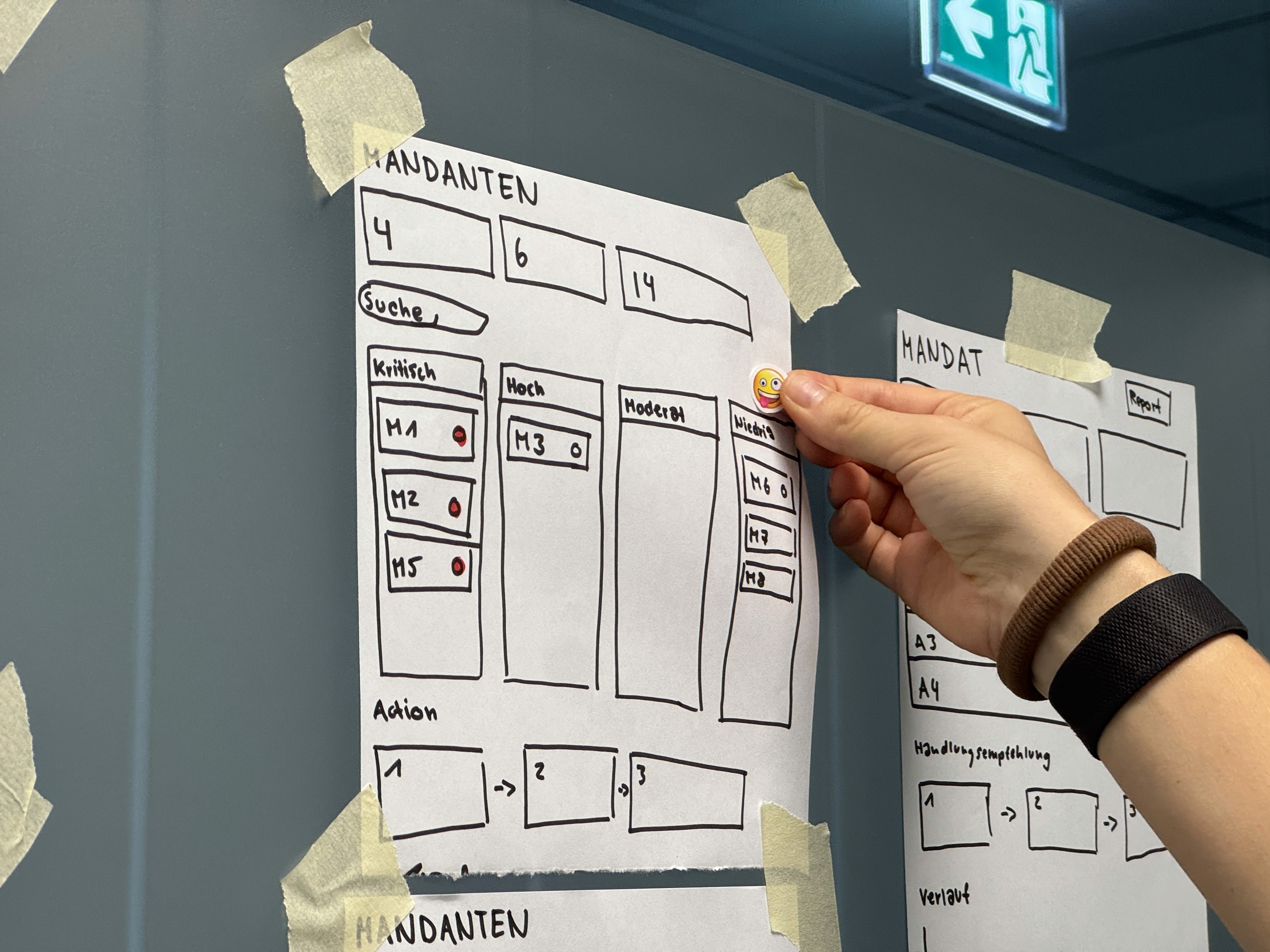
01 — A feature that touched everything

Not just a new screen – it reshaped navigation, data model, and core pages across the product.

01 — A feature that touched everything

Not just a new screen – it reshaped navigation, data model, and core pages across the product.

02 — One system, many clients

Each customer gets their own space. Assets, vulnerabilities, team – clearly separated.

02 — One system, many clients

Each customer gets their own space. Assets, vulnerabilities, team – clearly separated.

03 — The right people see the right thing

Contributors are assigned per client. No shared access, no accidental overlap.

03 — The right people see the right thing

Contributors are assigned per client. No shared access, no accidental overlap.

04 — New audience, existing foundation

We extended existing pages instead of replacing them – so nothing broke for current users.

After five usability tests, we had clear findings and concrete next steps. The production stop of the software prevented full implementation – but the concept and test results are ready to go.

Learnings

What I take away

Flows before Screens

The best insights came from watching what users tried to do, not from designing what a screen should show. Designing around tasks kept us from solving the wrong problem.

Flows before Screens

The best insights came from watching what users tried to do, not from designing what a screen should show. Designing around tasks kept us from solving the wrong problem.

Assume and then test fast and often.

Starting with limited knowledge isn't a blocker. Making assumptions explicit and testing them early gave us more clarity than extended research would have.

Assume and then test fast and often.

Starting with limited knowledge isn't a blocker. Making assumptions explicit and testing them early gave us more clarity than extended research would have.

Wording is crucial

No visual improvement can fix confusing language. Right words remove friction, wrong ones create problems no layout can solve.

Wording is crucial

No visual improvement can fix confusing language. Right words remove friction, wrong ones create problems no layout can solve.

Judith Schmeier | Senior UX Designer - Product & Usability

based in Augsburg | looking for Jobs here or nearby

hello@schmeierhaft.de

© 2026 Judith Schmeier All rights reserved

Judith Schmeier | Senior UX Designer - Product & Usability

based in Augsburg | looking for Jobs here or nearby

hello@schmeierhaft.de

© 2026 Judith Schmeier All rights reserved

Judith Schmeier | Senior UX Designer - Product & Usability

based in Augsburg |
looking for Jobs here or nearby

hello@schmeierhaft.de

© 2026 Judith Schmeier All rights reserved